Color in fashion stopped being just aesthetics a long time ago. Back in the second half of the 20th century, the industry began treating color as a tool of influence - just think of how Pantone turned a palette into a global language read simultaneously by designers, brands, and consumers.
But there's one detail that gets overlooked. Color isn't about what's "trending." And it's definitely not about "it doesn't suit me."
That's a myth that's lived in wardrobes for far too long. There's really no such thing as colors that "aren't yours." There are only shades that either work with you - or against you. And that's exactly where things get interesting.
How color became a tool, not decoration
The Spring–Summer 2026 season made this clear. On the runway, color doesn't shout - it structures the look.
Prada's collections bring in cool, almost translucent shades of white and blue. Jil Sander works with a stripped-back neutral palette, where color becomes form. Gucci, meanwhile, leans into deep accents: red, purple, chocolate.
This isn't about different trends. It's about different states of mind. And about a choice we make every day - often without even realizing it.
That's why the question is no longer which color to choose.
The question is how to find your own shade within it.
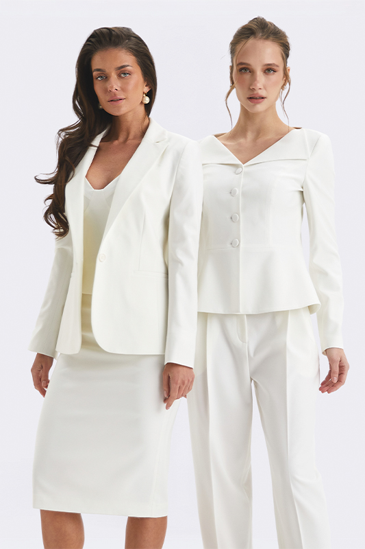
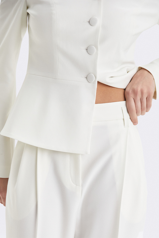
Cloud Dancer - the quiet that works
Light shades have stepped out of the background role. This season, they're the foundation.
Cloud Dancer is that same milky white, only cleaner, more composed. You could spot it at The Row and Max Mara - as a finished look, with no need for accents.
It's a color of clarity. It doesn't try to grab attention - it holds it through calm.
In Natali Bolgar's suits, it works as form: it holds the silhouette without complicating it.
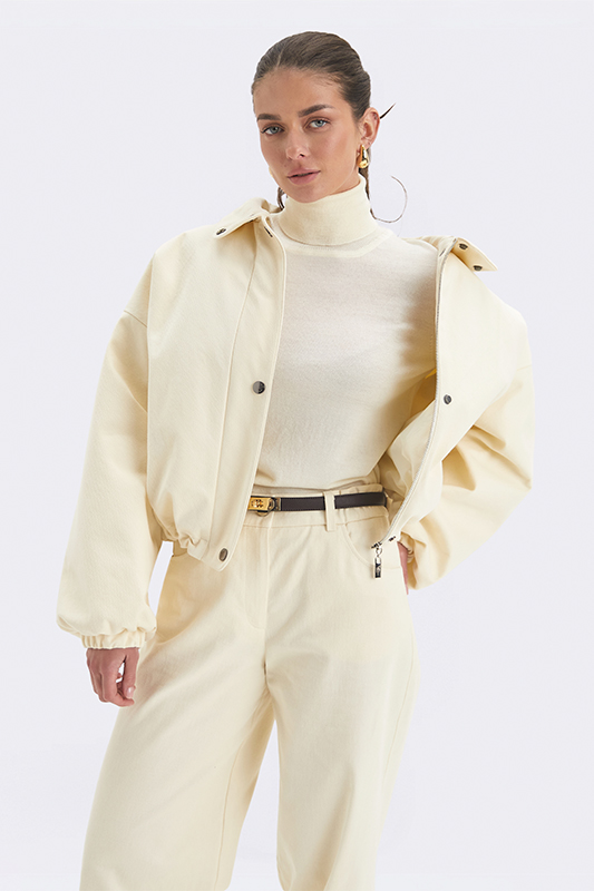
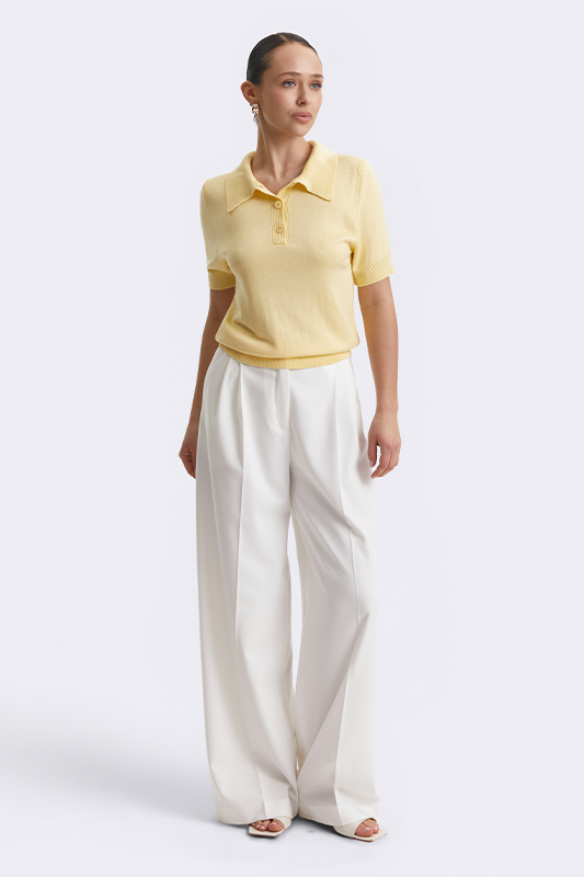
Butter Yellow - soft confidence
Yellow no longer requires courage.
At Loewe and Bottega Veneta, it reads muted - creamy, warm, almost neutral.
Butter Yellow isn't about brightness. It's about light within the look.
That's exactly why it slots so easily into a wardrobe - as an alternative to beige or white.
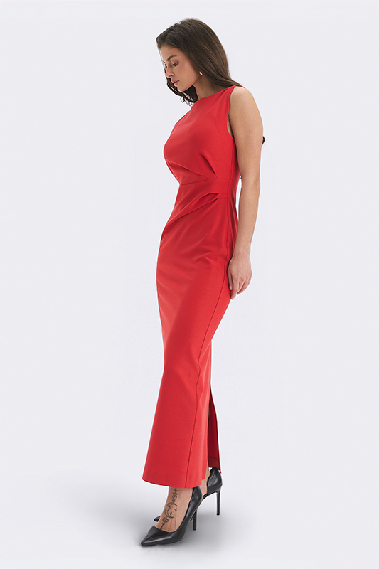
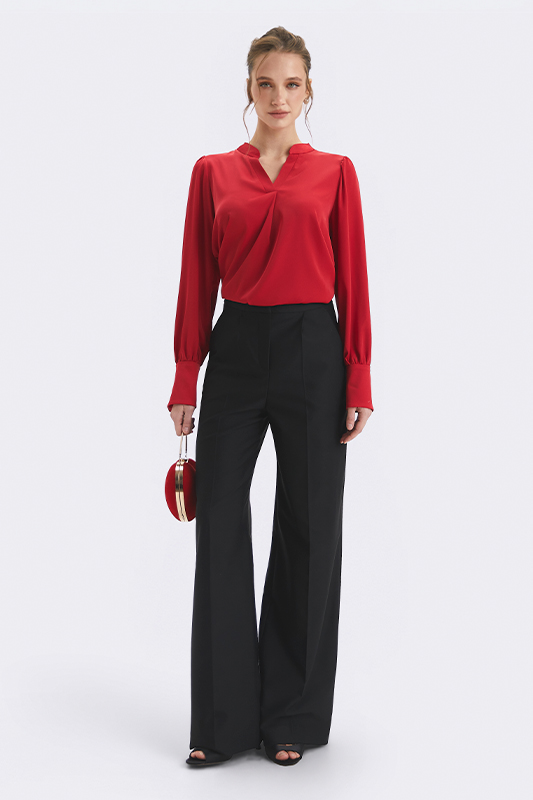
Red - when energy becomes composed
Red never disappears. It just changes its intonation.
In Yves Saint Laurent's collections, it always worked as a gesture. At Valentino, it turned into a code.
In the SS26 season, this color reads differently - restrained, precise, without excess drama. It's no longer about emotion. It's about inner certainty.
That's why red as a basic works as an anchor: it doesn't overload the look, it pulls it together.
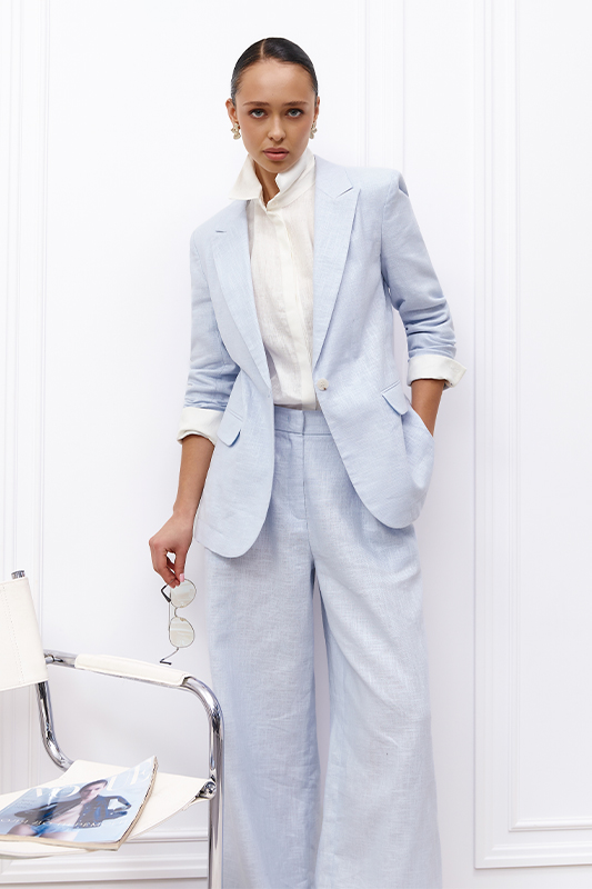
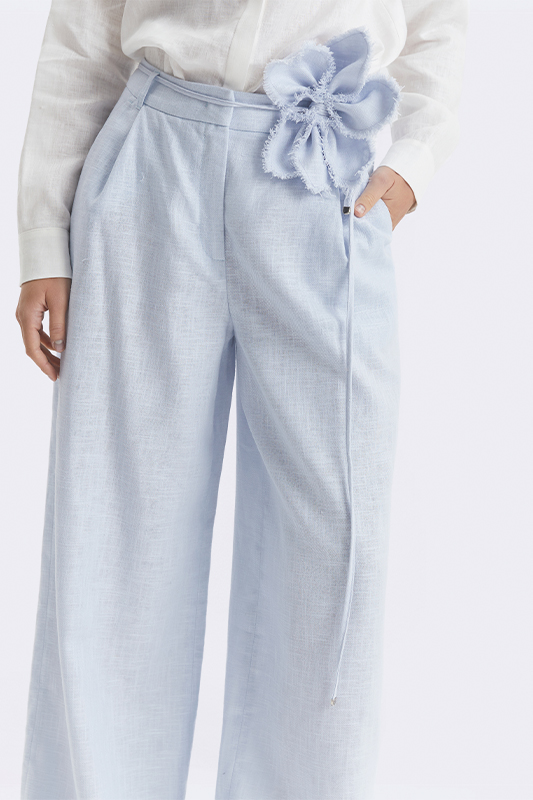
Soft blue - the color that eases tension
Blue this season is about the air between decisions. At Prada and Stella McCartney, it looks light but never childish.
It's a complex shade. It doesn't add softness - it removes excess sharpness.
In tailored pieces, this works especially precisely: the silhouette stays composed, but reads lighter.
Purple - depth without explanation
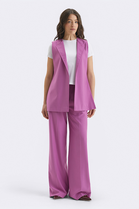
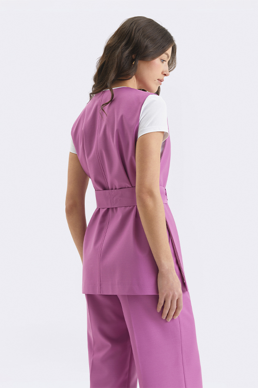
Purple is coming back not as an effect, but as meaning.
At Dries Van Noten and Gucci, it appears in complex combinations - it doesn't dominate, it unfolds gradually.
This is a color that doesn't try to please. And that's exactly why it's memorable.
Beige and chocolate - the system that holds everything
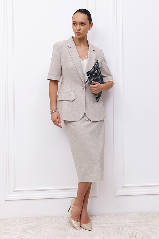
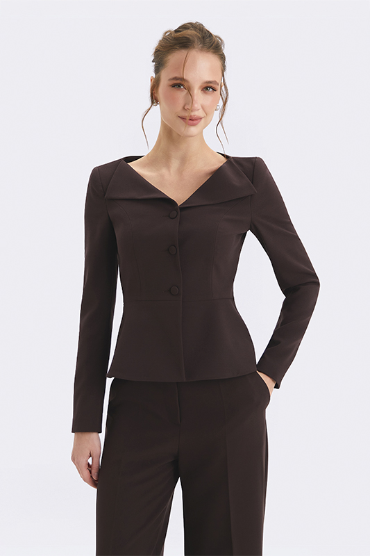
Trends change, but the base stays.
At Max Mara and Hermès, beige and chocolate look like the new classics - not trying to be current, yet always right for the moment.
These colors don't grab attention. They hold it. And they're exactly what lets the whole palette work as a system.
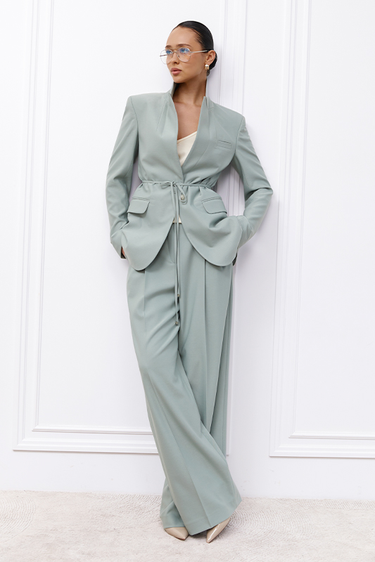
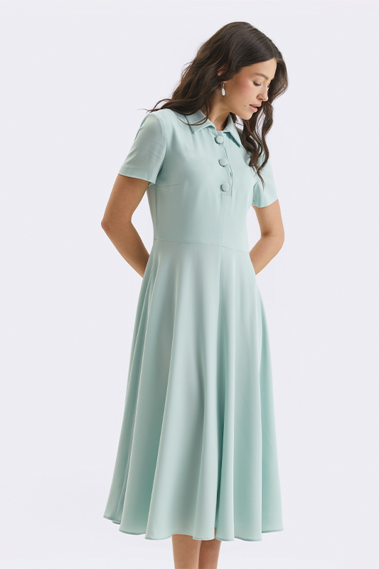
Mint - a fresh decision with character
Mint this season reads more restrained and precise than usual.
In Fendi's and Prada's collections, it appears in clean, composed looks - without excess decoration. It's a shade that refreshes a wardrobe without simplifying it.
It works delicately: it adds air while keeping a sense of composure, and pairs easily with both a light base and deeper colors.
How this works in your wardrobe
Color only matters when it holds up in real life. Not in a frame. Not on the runway. In movement, in the rhythm of the day, in moments when there's no time to "change again."
That's why the question isn't which color to choose, but which of its shades actually works for you.
The simplest guide is your own face's reaction: "your" shade evens out skin tone, sharpens the eyes, and pulls the features together. "Not yours" casts a shadow, adds fatigue, and creates the feeling that the look exists separately from you.
And at some point, something else becomes clear: your wardrobe stops being a set of "what to wear" decisions. It becomes a space where everything already fits together.