There's one fashion habit most people never even notice.
We open the closet, choose among dozens of pieces, and almost automatically reach for black. It's practical, after all. Versatile. It "goes with everything."
At least, that's what we're taught to believe.
The irony is that black became a wardrobe staple relatively recently. Look back through fashion history and for centuries the status colors were navy, burgundy, shades of chocolate, cream and grey. A truly deep black dye stayed a costly luxury for a long time, and in certain periods it was associated first and foremost with mourning.
Only in the twentieth century, largely thanks to Coco Chanel and her legendary little black dress, did black finally settle in as a symbol of elegance. And it held that position for decades. But that doesn't mean it's always the right answer.
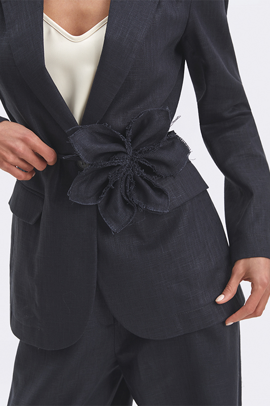
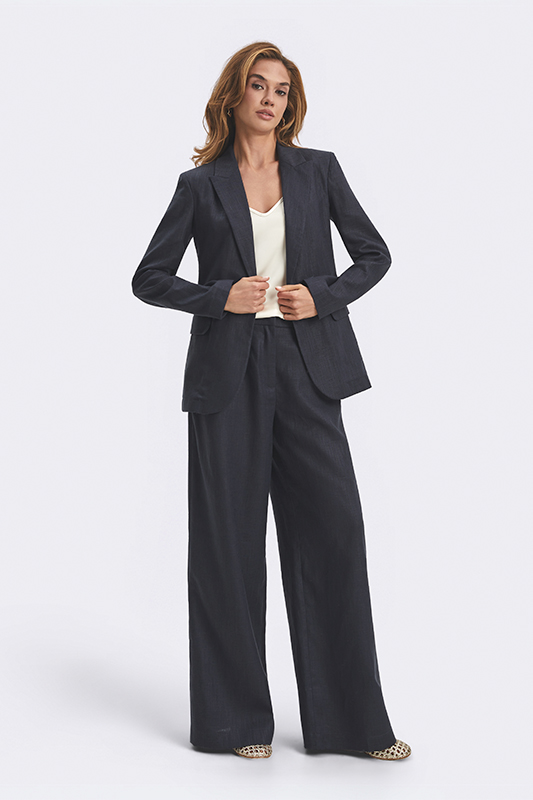
Navy: the strongest alternative
If any color can rival black for sheer versatility, it's navy.
It's often called the color of diplomats — hence the nickname.
It carries the same restraint but reads softer against the face, especially in daylight. It's no accident that Giorgio Armani spent decades working with navy, graphite and blue-grey tones. They add depth to an outfit without tipping it into severity.
Navy pairs easily with cream, beige, grey, burgundy and soft powder blue.
Which is exactly why it's often more practical than black.


Cream and buttermilk: the new classics
Some colors need no explanation. Cream is one of them.
Unlike bright white, it reads calmer, warmer, and fits into an everyday wardrobe far more easily.
The same goes for creamy tones in general, including the much-talked-about butter yellow. A few years ago these would have been called a trend. Today they look increasingly like the new base, especially in summer.


Chocolate, camel and sand
If quiet luxury has an official palette, it starts somewhere around here.
Chocolate, caramel, camel and sand are colors that almost never look accidental.
In recent years they've become the leading players in collections by The Row, Max Mara and Loro Piana. The reason is simple: these tones work especially well with texture. Linen, cotton, knitwear, suiting fabrics — everything starts to look more interesting, without a single logo in sight.


Khaki and olive: an underrated base
Khaki was once considered a color for a very specific kind of wardrobe. Today it's long since taken on a life of its own.
Olive, sage and muted green combine surprisingly well with cream, chocolate, denim, blue and most neutral tones.
And, most importantly, they almost never get old.


Burgundy: when you want color
Not everyone wants to live in a beige palette. And that's perfectly fine.
This is where burgundy, marsala, wine and ripe-cherry tones take the stage.
They give a wardrobe character without turning it into an experiment. Which is exactly why burgundy is often called the new black for anyone a little tired of actual black. And there's some truth to that.


Blue and pastel shades
Another interesting shift in recent seasons: pastels have stopped being a strictly spring story.
Sky blue, cream, powder pink and light grey are increasingly working as a full-fledged base. They freshen up a look, lighten it, while staying neutral enough for everyday wear.
Which is why blue can be spotted just about everywhere today — from shirts to suits.


Grey: the wardrobe's quiet strength
Interestingly, one of the strongest base colors rarely gets the spotlight.
Grey doesn't make headlines and never becomes the season's viral color. But it keeps working.
Especially in suiting, knitwear and outerwear. Which is perhaps exactly why good designers love it so much.
Grey doesn't try to draw attention. It just does its job.


How to tell if a color can become your base
There's a simple test. A color can become a base if it:
- pairs easily with at least half your wardrobe;
- looks good in daylight;
- doesn't grow tiresome after a few months;
- works across different styles — from casual to business;
- doesn't require complicated color combinations.
There's one more important test: you should actually want to wear it often. Because a base isn't meant to look good on a hanger. It's meant for real life.
In Natali Bolgar's recent-season collections, these are exactly the tones that keep showing up: cream, khaki, chocolate, blue, camel, deep navy.
These aren't simply an alternative to black or a passing trend — they're colors that slip easily into a wardrobe and don't lose relevance from one season to the next. That's usually what a good base looks like.
Black remains a classic. But style doesn't begin where the right answers are — it begins where alternatives appear.