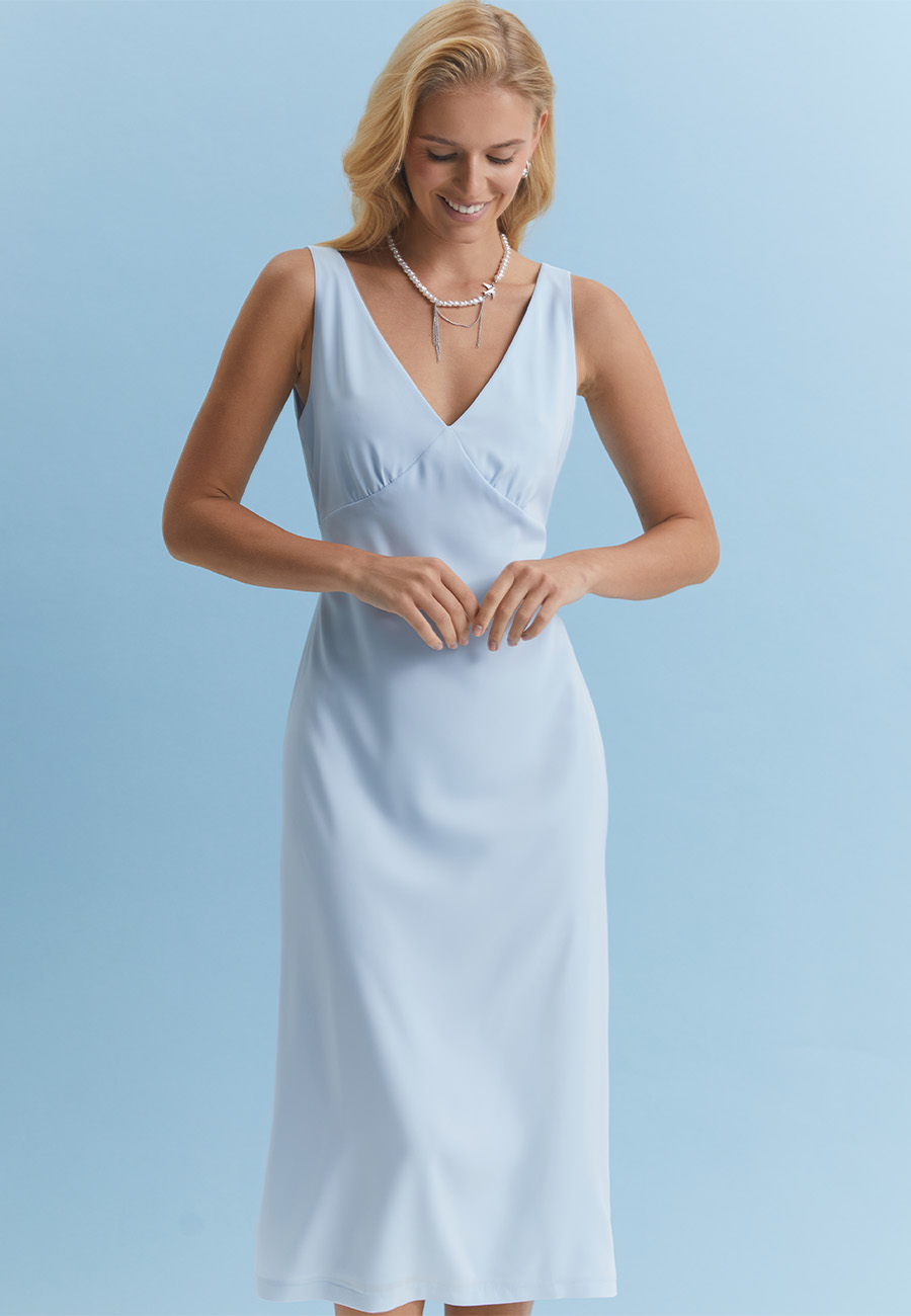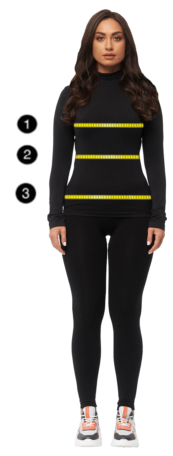
Almost every woman has noticed this at least once.
The same dress can make your face look fresh. Almost rested. Skin appears smoother, eyes brighter, features softer.
And another shade suddenly emphasizes tiredness. Redness. Shadows under the eyes. And this has nothing to do with "bad makeup" or poor lighting.
It's about color.
More precisely — about its temperature, depth, and how it interacts with your complexion.
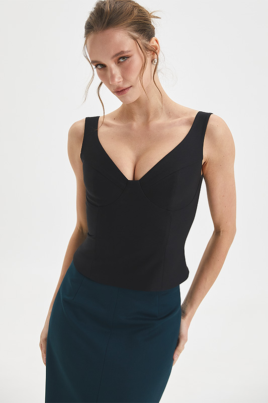
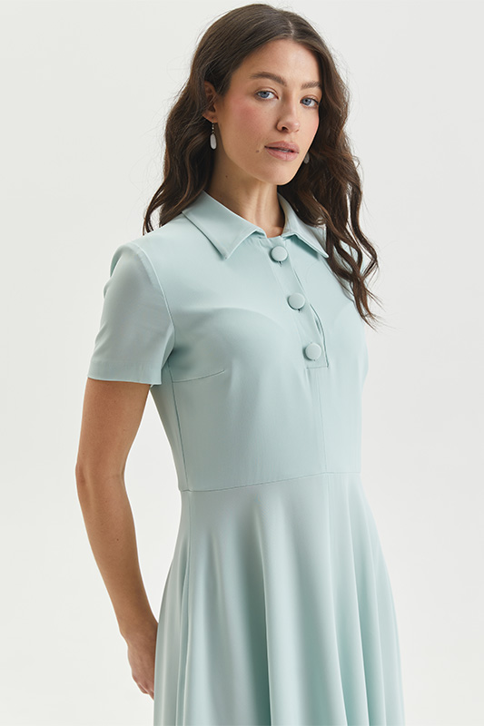
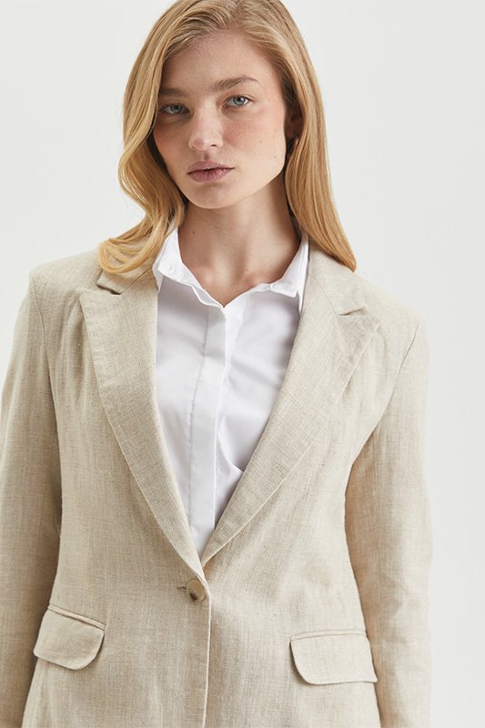
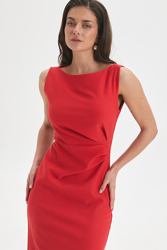
Why color-type theory still works
The system of seasonal color types once became almost a pop-culture phenomenon. After the book Color Me Beautiful came out in the 80s, women everywhere started figuring out whether they were a "spring," "summer," "autumn," or "winter."
Later, the industry turned it into something of a caricature: endless charts, banned colors, and a strange sense that someone "wasn't allowed" to wear yellow or purple.
But the underlying idea was correct.
Different shades of the same color really do suit us differently.
And this isn't about fashion. It's about the physics of color.
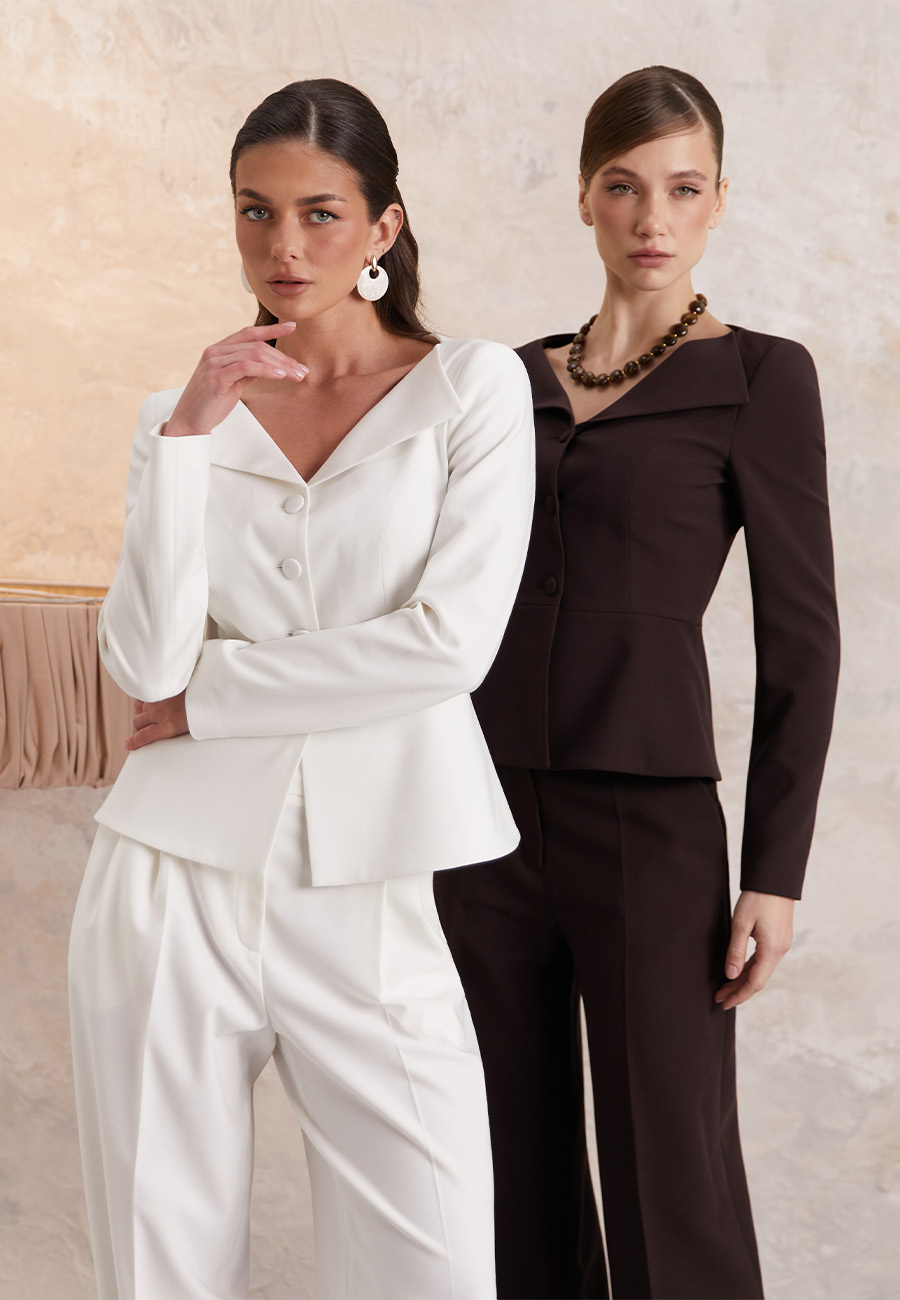
Your skin always speaks first
The main reference point isn't your hair. It isn't even your eyes. It's your skin.
It's the undertone of your skin that determines which colors will work near your face and which will clash.
A warm undertone usually has a golden, peachy, or slightly honeyed cast. A cool undertone leans pink, bluish, or lilac.
Sometimes it's barely noticeable. But that's precisely why one beige looks expensive and pulls a face together, while another leaves it looking dull.
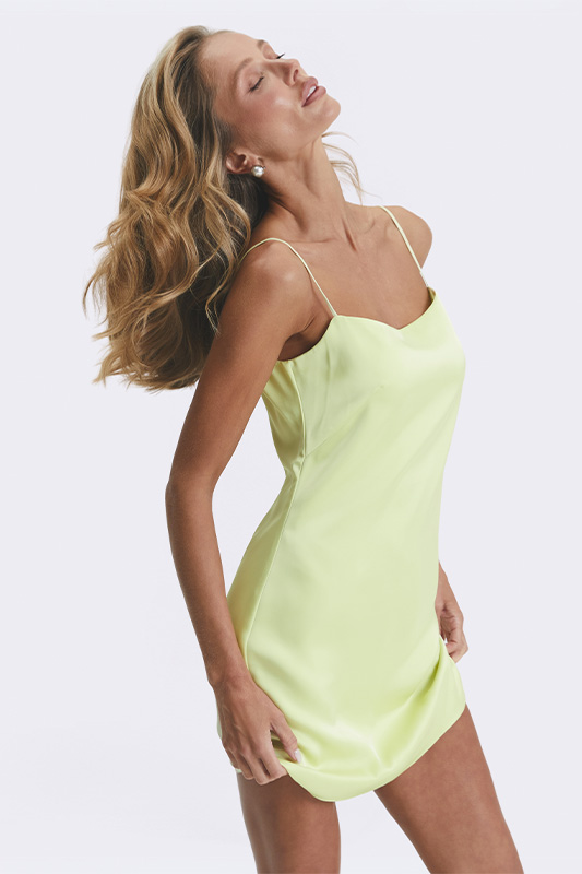
Contrast matters more than you'd think
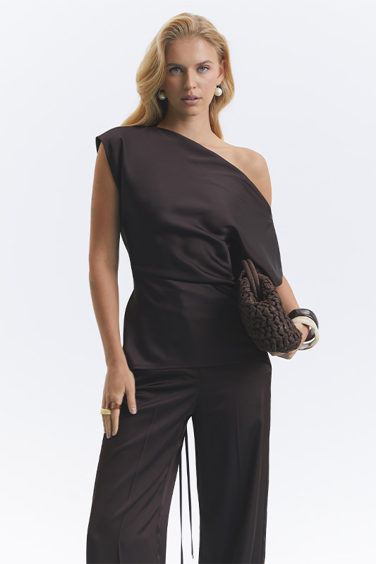
Some women can carry bold colors.
Black against pale skin. Vivid cobalt. Deep chocolate. Sharp contrasts.
Others simply disappear in combinations like that.
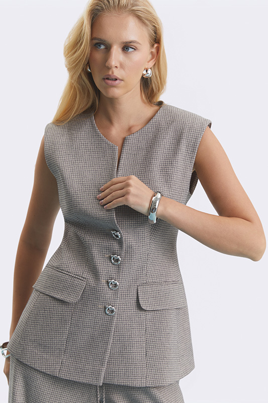
For them, complex, muted shades work better: smoky blue, warm milk, subdued khaki, faded pink.
That's exactly why two women can try on the same shirt — and get completely different results.

How to find your color type without complicated charts
The simplest way is to stop looking at the garment. And start looking at your face.
Take a few pieces in the same color but different shades. For example: warm beige, pink-beige, cool sand.
Hold them up near your face in daylight. No makeup. No yellow evening lighting, which deceives everyone.
And watch not the color itself, but your skin.
Does it look smoother?
Do your eyes look brighter?
Or, on the contrary, does tiredness, greyness, or harshness appear?
The body usually answers faster than logic does.
A test almost no one does
There's another simple method — a sheet of white paper.
Hold a white sheet against your arm in daylight. This helps you see your skin's real undertone without the influence of your clothing's color.
Sometimes the difference becomes obvious right at that moment.
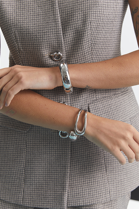
Silver or gold
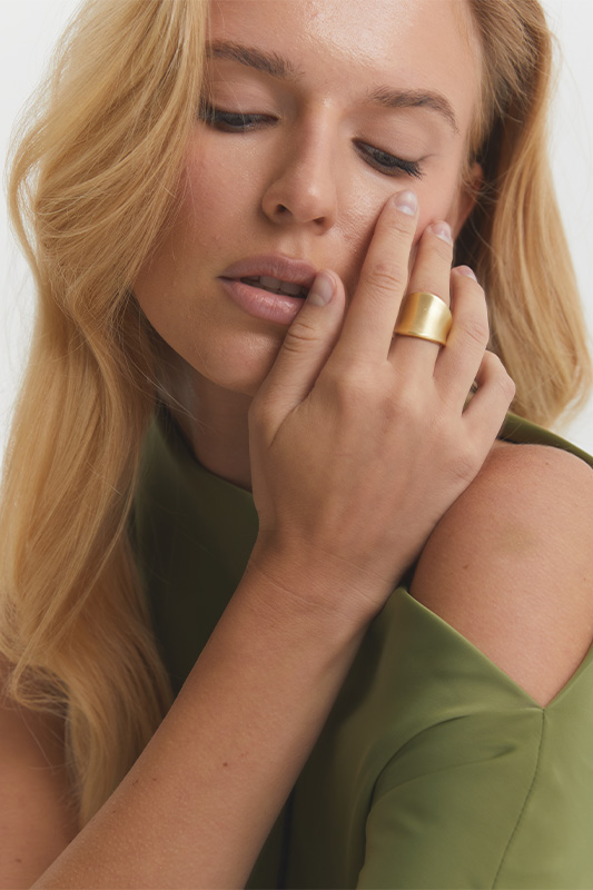
Another old but accurate test — metal. Hold silver and gold against your wrist.
If your skin looks warmer and more alive next to gold, you likely have a warm undertone. If silver looks better, you're cool-toned.
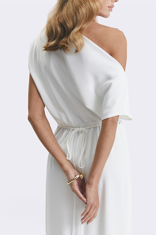
But things get really interesting when both work equally well.
How to build your palette
Once you've identified your undertone and level of contrast, putting together a wardrobe becomes much easier.
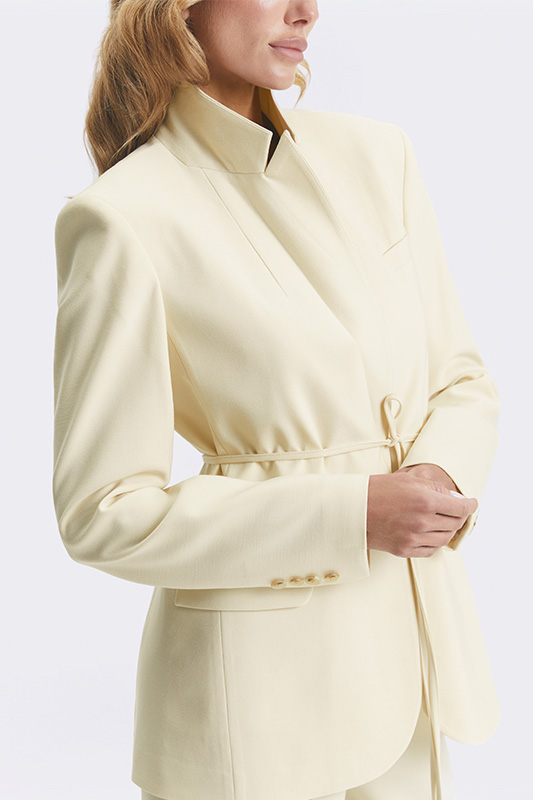
A warm color type is usually best served by shades with a soft golden or earthy undertone: cream, caramel, warm khaki, chocolate, olive, muted coral.
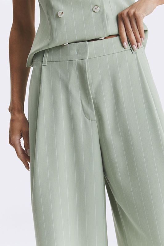
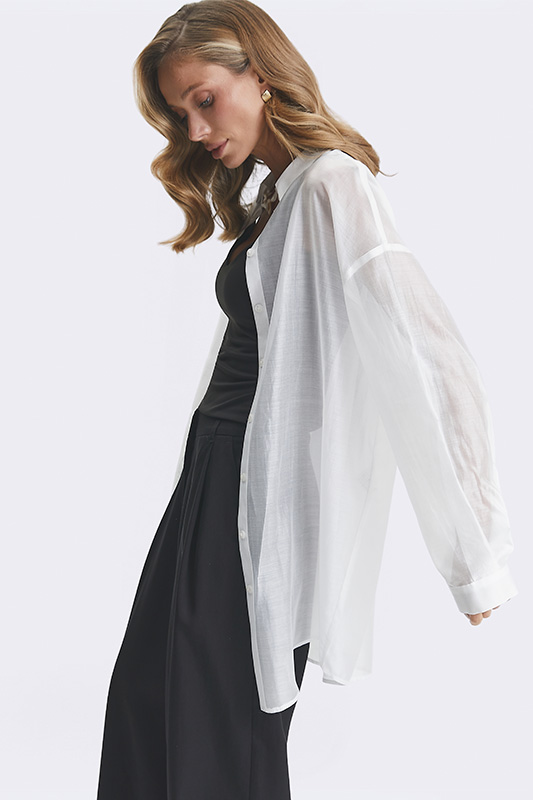
A cool color type suits colors with an ashy or bluish base: graphite, cool beige, berry tones, ice blue, pure black, grey-pink.
Next, pay attention to contrast. If your features are soft, overly bright colors can overwhelm your face. If your features are contrasty, overly muted shades will make them less expressive.
That's why a good palette isn't a set of fashionable colors. It's colors that support your appearance rather than argue with it.
A neutral type isn't a problem — it's freedom
Many think a "neutral type" means being undefined.
In reality, it's almost a privilege.
This kind of coloring often suits both warm and cool shades. There are fewer restrictions, and the palette is wider.
Though even here there are nuances: some people suit clear, pure colors better, others suit muted ones.
Why this transforms your wardrobe
When a woman understands her shades, her wardrobe becomes far more considered.
Fewer impulse purchases. Fewer pieces that are "pretty, but somehow off." Less fatigue from fitting rooms.
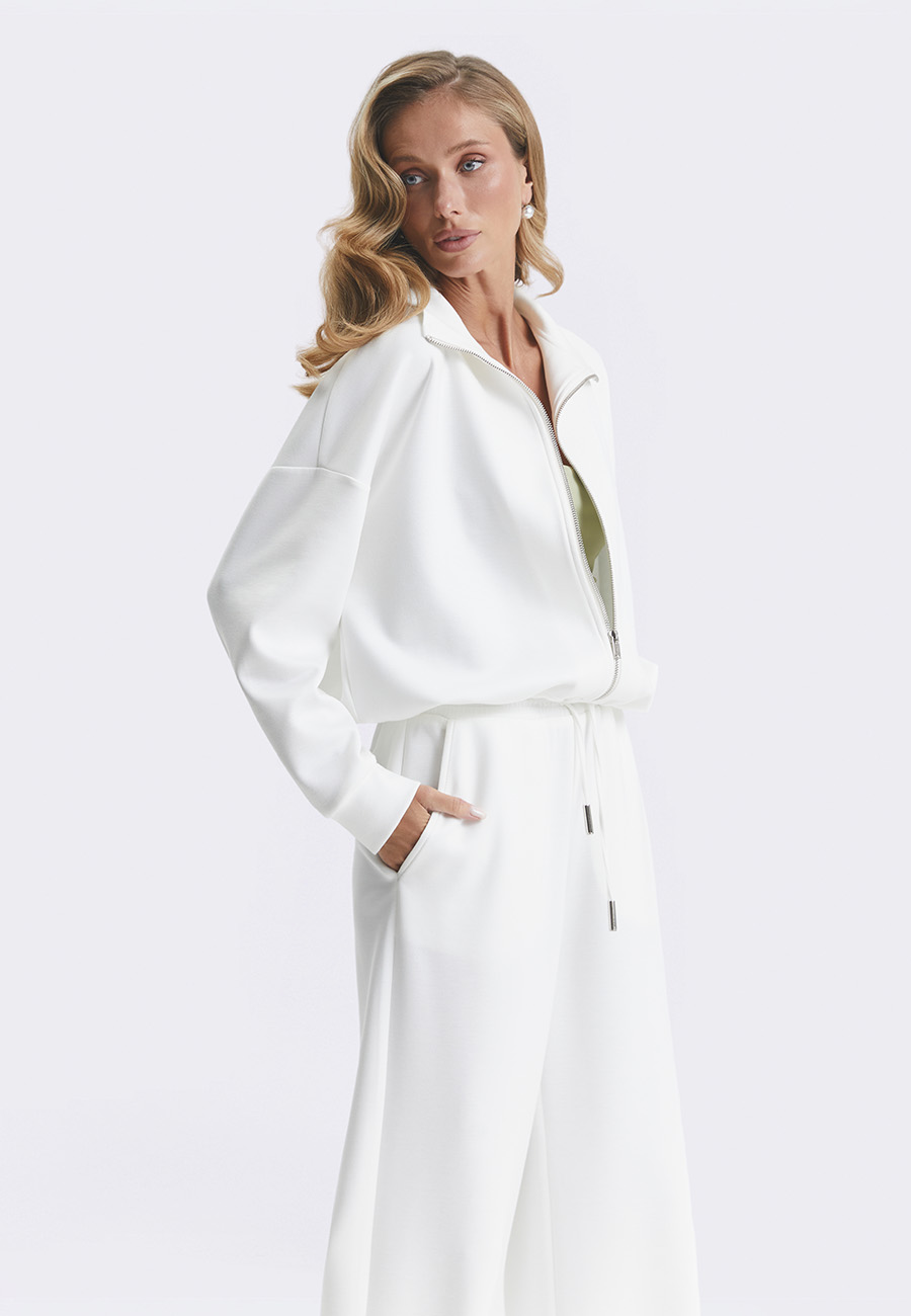
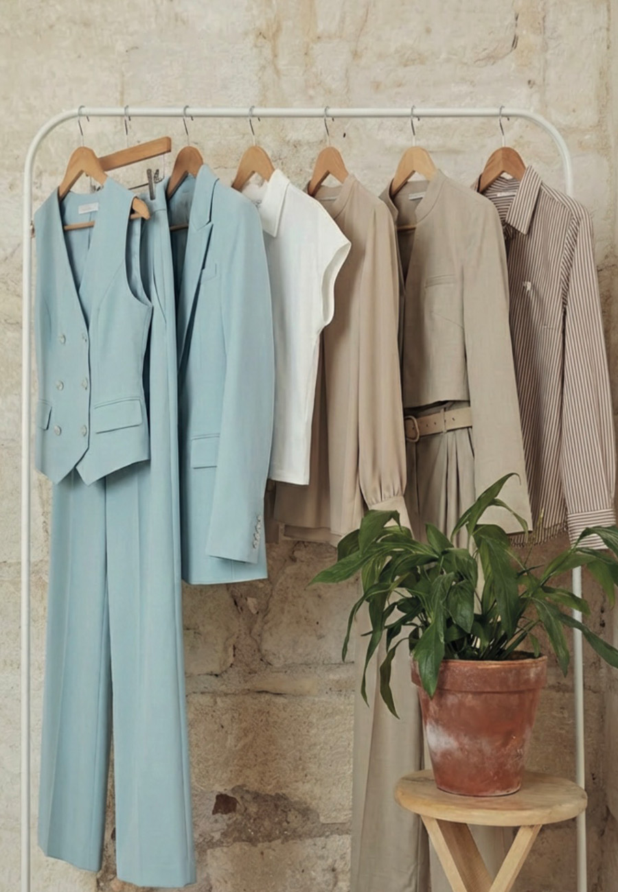
That's exactly why Natali Bolgar collections pay so much attention to palette. Not just colors — shades. Milk-white can be warm or cool. Blue can be clear or dusted. And that is exactly what changes how a piece "reads" next to a person.
And perhaps that's why the right shade can change more than the silhouette itself.