How to organically incorporate bright pieces into your wardrobe?
One glance at the new collection and color is the first thing you notice. The designers have delivered a riot of vivid, saturated hues. It's a kind of color therapy, in a way — bright colors stimulate the production of "feel-good" hormones and lift the mood, both for the woman wearing them and for everyone around her.
Which bright colors are trending?
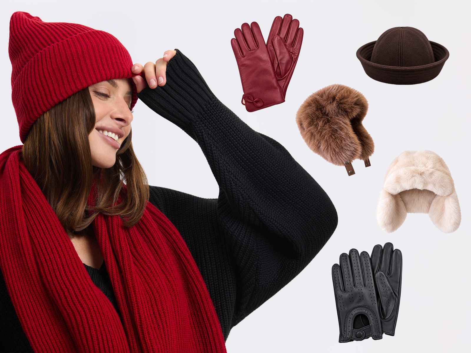
If this trend appeals to you, we recommend looking at these colors: red, green — from pastel to emerald, orange-brown, blue, and cornflower blue.
How to organically incorporate bright pieces?
The most important thing when chasing a fashionable look is not to overdo it. So below, we'll look at how to organically incorporate bright pieces into your wardrobe.
1. Monochrome
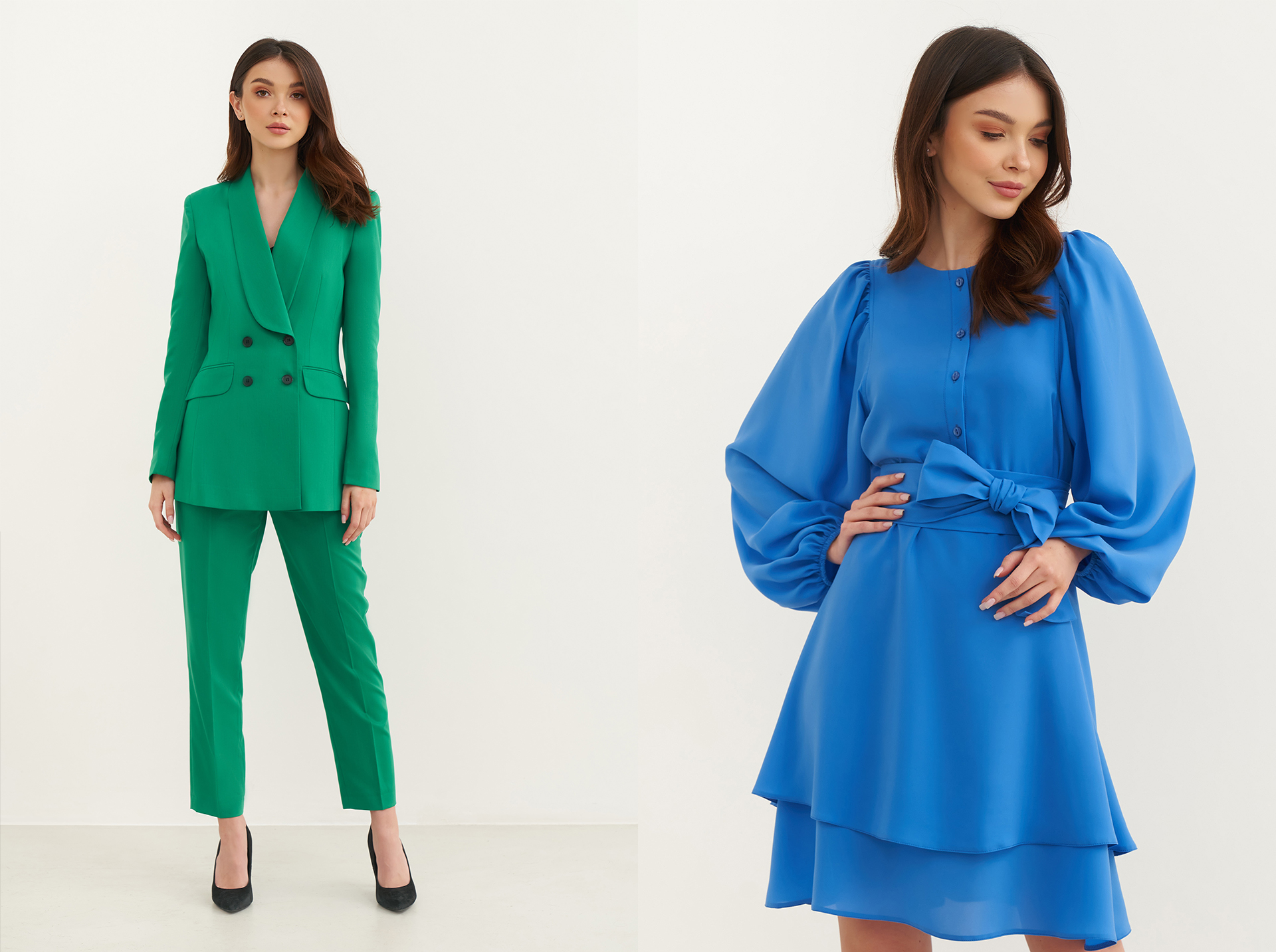
Simple monochrome bright outfits
The simplest option is to buy a suit or dress in a single color. A monochrome look always feels fashionable and stylish, yet it spares you complicated decisions and the agony of choice, since the designers have already done the work for you. Buy it, put it on, and go!
2. Accent
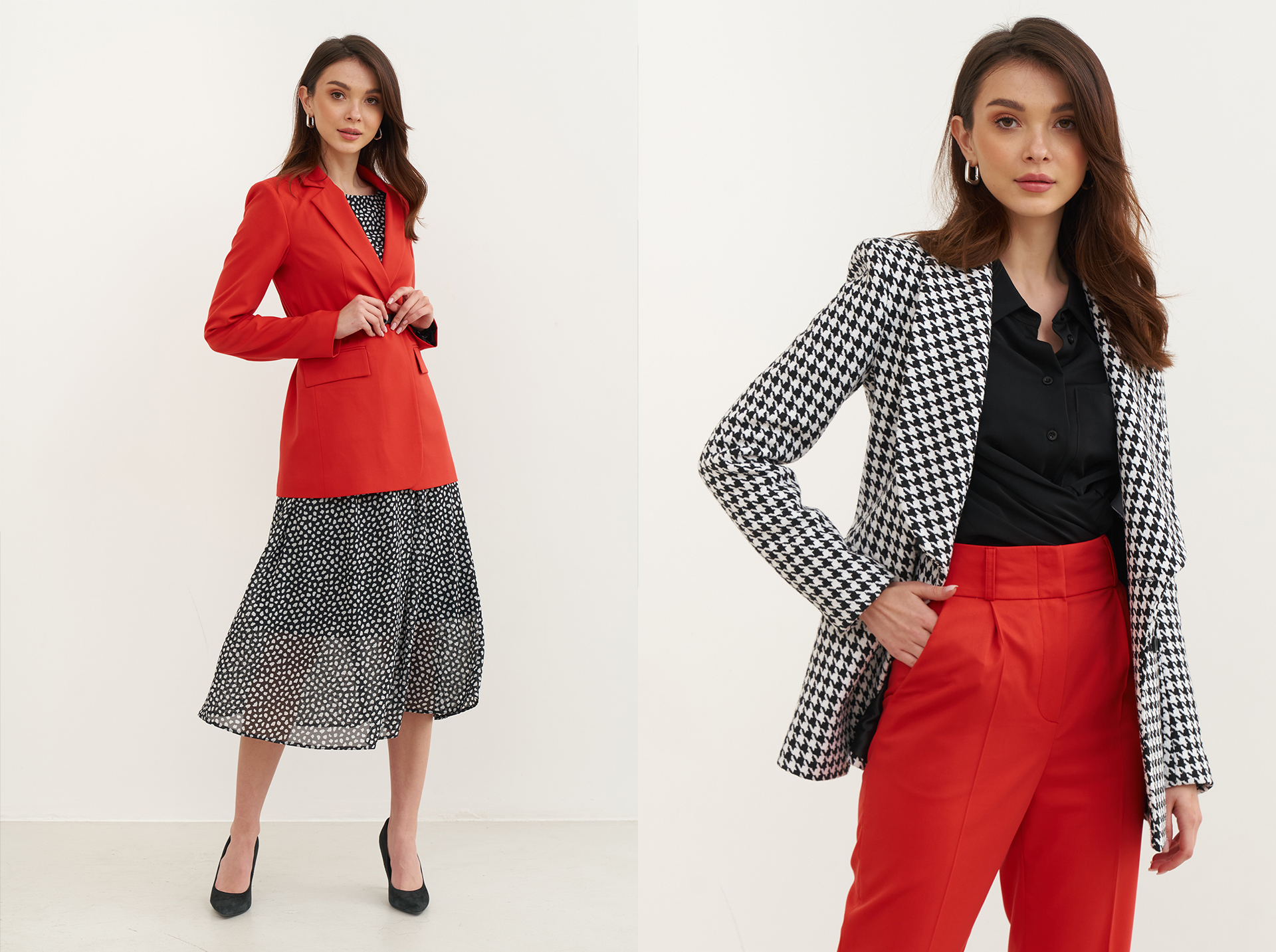
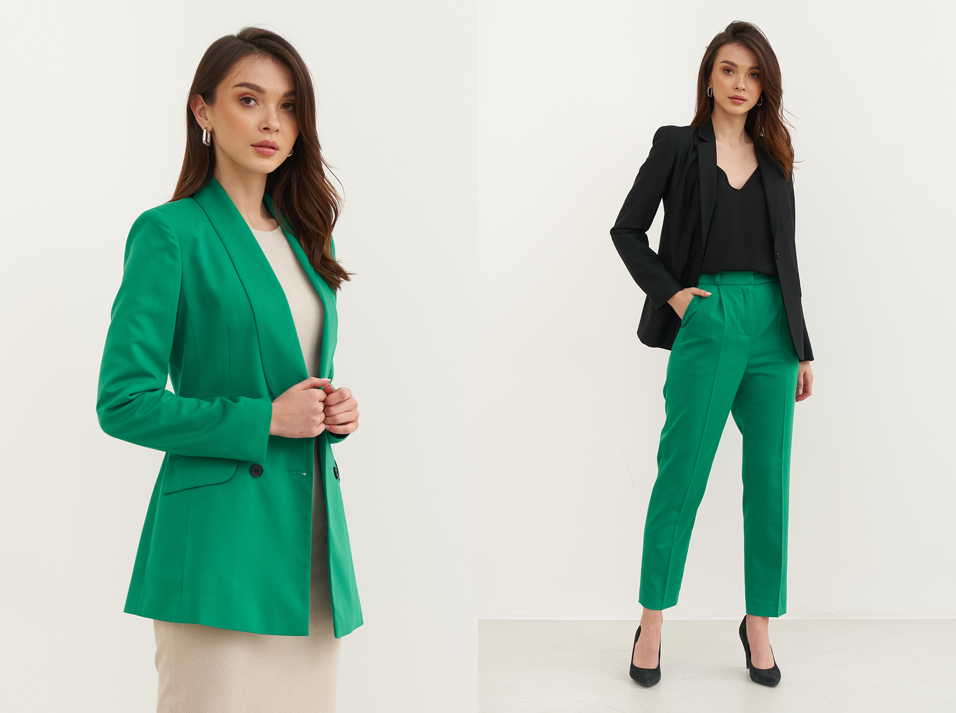
Using a bright piece as an accent
An option for those who want to look fresh without overdoing it. Build a restrained look in classic prints and textures, then choose one bright piece as your accent. For example — a bright jacket with an understated dress, or bright trousers with a classic top.
How to combine bright colors and prints?
3. Combining two colors, or a bright color with a print
Сміливі поєднання кольорів та принтів
Combining several bold colors, or a color with a print, in one look is next-level styling — a statement that's sure to draw attention. But interestingly, the on-trend 2021 colors mix and combine beautifully with one another.
Пропорції кольорів в одязі
To avoid overdoing it and keep the look harmonious, you'll need to remember a bit of math. There are three basic proportions recommended for complex combinations: 70/30, 60/40, and 60/30/10.
What these numbers tell us is that one bright element should be slightly more dominant than the other. These proportions help maintain harmony in the look.